
Creating a hero header with a fixed image
In this tutorial I'm going to show you how to create a Hero header with a fixed image as the background and an overlay gradient on top. The image will have cover the whole screen with some text and a call to action in the middle.
As always, we are going to use tailwind for this! You can take a look at the final result here:
See the Pen Fixed Hero Header by Crysfel (@crysfel) on CodePen.
Defining the markup
The first thing we are going to do is to define the markup for the header, as a rule of thumb I always try to use as few elements as possible. For this header we only need:
<header>
  <h1>Welcome Home</h1>
  <p>Connect with people and find new friends! Join our community<br> of professionals around the world.</p>
  <p><a href="#">Sign up</a></p>
</header>
That's all! As you can see is something very simple, that's what we always should try to achieve: simplicity!
Setting up the background
Given that we don't have a stylesheet, we are going to use the style property to set the background image to the header element.
<header
  style="background-image: linear-gradient(rgba(135, 80, 156, 0.9), rgba(135, 80, 156, 0.9)),url(https://musicapp.bleext.com/storage/users/14/posts/69/php7CGTMq.jpg)"
>
A couple of things are happening here:
1.According to the documentation, we can set as many images as we want, we only need to separate each image with a comma. Each image will render on a stack, one on top of the other.
1. The first image we are going to define at the very top is the linear-gradient, we are setting the colors at 90% opacity, this will allow us to see the next image at the bottom of the stack.
1. The second image on the stack is an actual jpg image, this image will be displayed under the linear gradient, that's because it's the second value on the stack.
So now the question is, why are we not using tailwind gradients? Why do we need to use the style property and manually set our own values?
First, we need to under that tailwind provides general utilities for our elements, but when it comes to customizations we can't rely on tailwind alone. And by that I mean the classes that come out of the box, we will have to either create a plugin, use a regular stylesheet or use the style property.
Second, if we use the bg-gradient-to-r from-teal-400 to-blue-500 we will get a nice gradient, however, when we set the background-image with our jpg file, the gradient will be overwritten and we will lose the gradient.
To prevent that, we need to take advantage of the stack, meaning we need to first set the gradient and then the image file.
Lastly, the gradient has an opacity that allows us to see the image, we would need to define those colors with the opacity on our tailwind.config.js file in order to use them, but we really don't have to if we are only using them a single time in our whole project.
So far this is how our header is looking:
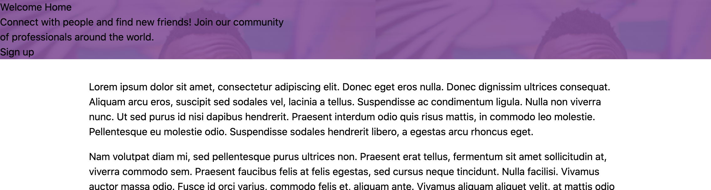
As you can see, we have the background image in there as well as the purple gradient.
Styling the background
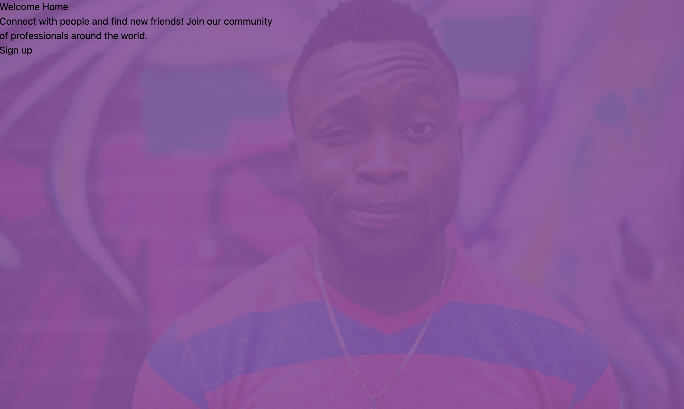
The next thing we need to do is to set the height of the header to take the whole screen, then we need to make sure the image is not repeating but instead covers the whole space.
<header
  class="h-screen bg-fixed bg-center bg-cover bg-no-repeat"
  style="..."
>
- The
h-screenclass will set the height of the header to take 100% of the viewport height. bg-fixedwill keep the image fixed when the user starts scrolling down, giving us a really nice effect.bg-centerwill center the image on the container, we use it to make sure we are always showing the dude in the middle of the picture, otherwise smaller devices (phones) might only show the wall in the image.bg-coverstretches the background image to make sure it fits on the whole container, but at the same time it keeps the right ratio.bg-no-repeatprevents the image from repeating.
After those changes our header looks like this:
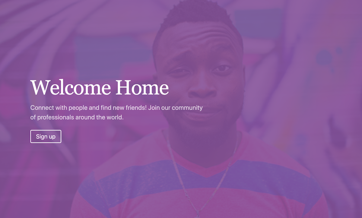
Centering the text and styling content
In order to center the text on the screen, we can use flexbox, all we need to do is to set the display to flex and the direction to column. Then we can justify the content to the center.
<header
  class="flex flex-col justify-center ..."
  style="..."
>
To style the title we are going to add some margin to the left, make it white, increase the font size, and decrease the letter space.
<h1
  class="ml-24 text-white text-6xl tracking-tight font-serif leading-none"
>
  Welcome Home
</h1>
For the text, we are just going to set the color to white, add an opacity, increase the font size, and give it some margins.
<p
 class="mt-4 mx-24 text-xl text-white font-sans text-opacity-75"
>
  Connect with people and find new friends! Join our community<br> of professionals around the world.
</p>
Finally for the button, we are going to set a border of 2px, set the font color to white, add a rounded border, and set some hover styles.
<p class="mx-24 mt-8">
  <a class="px-4 py-2 border-2 border-white rounded text-white text-lg hover:bg-white hover:text-purple-700" href="#">Sign up</a>
</p>
Our final result should look like this:
If you scroll down, you will see how the image stays fixed while content scrolls, giving us a really nice effect.
That's all for now folks! If you want to learn more about tailwind make sure to subscribe to the newsletter.
Happy coding!
Did you like this post?
If you enjoyed this post or learned something new, make sure to subscribe to our newsletter! We will let you know when a new post gets published!